Color Correction 101: Adjusting Brightness, Contrast, and Saturation
Learn the fundamentals of color correction including brightness, contrast, and saturation adjustments.
What Is Color Correction?
Color correction is the process of adjusting an image's brightness, contrast, and color balance to make it look natural and appealing. It differs from color grading, which applies a stylistic look for creative effect. Correction aims for accuracy; grading aims for mood.
Brightness
Brightness controls the overall luminance of an image. Too low and details disappear into shadows; too high and highlights wash out to pure white. The goal is to distribute pixel values across the full range without clipping either end.
Contrast
Contrast adjusts the difference between the darkest and brightest parts of an image. Higher contrast makes images pop but can lose detail in shadows and highlights. Lower contrast produces a flatter look that retains more detail but appears less vibrant.
Saturation
Saturation controls the intensity of colors. A fully desaturated image becomes grayscale, while oversaturated images look artificial with colors that bleed beyond natural boundaries. Most images benefit from a modest saturation boost.
Recommended Settings by Image Type
Different images need different treatment. Here is a reference table for common scenarios:
| Image Type | Brightness | Contrast | Saturation | Notes |
|---|---|---|---|---|
| Portrait (indoor) | +10 | +5 | +5 | Watch for skin tone shifts |
| Portrait (outdoor) | 0 | +10 | +10 | Natural light needs contrast |
| Product (white bg) | +15 | +15 | +5 | Brighten to match Amazon standards |
| Landscape | -5 | +20 | +20 | Preserve sky detail, boost greens |
| Food photography | +5 | +10 | +15 | Enhance natural colors |
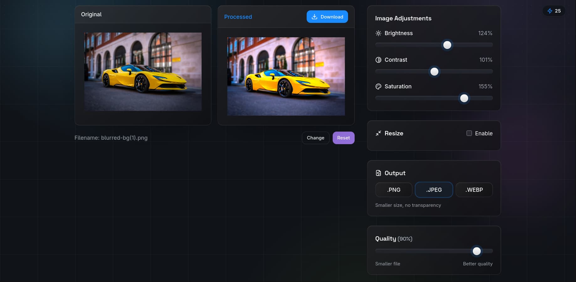
Step-by-Step Color Correction with QuickBG
Our adjust tool provides real-time sliders for all three adjustments. Here is the recommended workflow:
- Start with brightness. Set it so the histogram fills the range without clipping. Highlights should be bright but not pure white, and shadows should have detail.
- Add contrast. Increase until the image has visual punch but shadows and highlights still contain detail. A good test: you should see texture in both a white shirt and black hair.
- Adjust saturation. Boost until colors look vivid but natural. Skin tones are the best reference — if they look orange or flushed, you have oversaturated.
- Fine-tune in combination. These adjustments interact. Increasing contrast can make colors appear more saturated, so you may need to reduce saturation after adding contrast.
Comparison: QuickBG Adjust vs Manual Editing
| Adjustment | QuickBG | Manual (Photoshop) | Time Required |
|---|---|---|---|
| Brightness | Slider, instant preview | Levels / Curves | QuickBG: 5 sec, Manual: 30 sec |
| Contrast | Slider, instant preview | Curves / Levels | QuickBG: 5 sec, Manual: 30 sec |
| Saturation | Slider, instant preview | Hue/Saturation layer | QuickBG: 5 sec, Manual: 20 sec |
| Combined | One screen, all sliders | Multiple panels | QuickBG: 30 sec, Manual: 3 min |
Pro Tips for Better Color Correction
- Use a reference monitor. What looks good on your phone may look terrible on a calibrated desktop display.
- Correct before removing backgrounds. If your source image has a color cast, remove it first with the adjust tool, then use background removal. A clean source produces a cleaner cutout.
- Batch process for consistency. Edit one image to perfection, save your settings, and apply them to the rest of your catalog.
- Less is more. Subtle adjustments almost always look better than aggressive ones. If you notice the adjustment, you may have gone too far.
When Color Correction Is Not Enough
Sometimes an image needs more than basic adjustments. If the subject is poorly lit or has severe color casts, consider replacing the background entirely or cropping to a different composition. For advanced issues, check our FAQ page or explore all QuickBG tools.